


I write a lot about the Why behind the What. The Why > What > How framework is how I approach pretty much everything I work on, from my writing, to my tutorials, to the products I design. I thought it may be fun to explore how this purpose-driven approach informed the design of Edition 2 of the Bullet Journal notebook. I've not covered every feature, just the ones that are new or updated in Edition 2. With that said, allow me to geek out:
Bellyband
Since BuJo is a very self-directed practice, the biggest challenge designing the Bullet Journal notebooks was balancing structure with flexibility. I tried to design features so that they'd appear when they're needed and disappear when they're not.
Many features in Edition 2 are so subtle that they're easily missed. I needed a way to both draw attention to them, and explain how they're used. Many of these features are also easily understood, so permanently taking up valuable real estate inside the notebook with instructions didn't make sense.
I opted to wrap the instructions around the notebook using the bellyband. This also allowed some instructions to sit directly on the features they describe, like the Grid Guide. The remaining panels were used to provide additional Bullet Journal resources.

The Outside
The dimensions of Edition 2 are nearly identical to the Edition 1. It's the same height and width, but it is slightly thicker and heavier due to the new paper. More on that later.
I kept the dimensions the same because I wanted Edition 2 to sit well on the shelf with Edition 1. Cultivating a neat library of Bullet Journal notebooks is a wonderful bonus of this practice.
The only real difference on the outside is the treatment of the logo. This has always been a sticking point for me. I really don't like seeing branding on products, even my own. That said, the BuJo logo has become a call to action for me. It reminds me of what it's for. Surprisingly, a large majority of Bullet Journalists polled, felt the same way. They preferred having a logo on the cover over it being blank. Edition 2 strikes a balance by scaling down the logo and simplifying it with an elegant raised treatment.
In terms of color, there will always be the classic black. Each year will also feature an annual color, one only available for that year (or until the stock runs out.) This serves three purposes:
- It keeps our offering fresh and fun
- Over time, you'll see the years of your life/ BuJo library categorized by color
- It supports a core BuJo philosophy: Memento mori or "remember death." Remembering that all things will become the past, can help us pay closer to attention to the present. Color is as gentle reminder as I could think of to make the most out of every day.

The Grid Guide and Venn Diagram
Edition 2 was designed to embrace to diversity of the Bullet Journal community. This spread represents both form and function. The Grid Guide is a tool to help design-forward Bullet Journalists quickly layout their pages. The diagram represents the purpose of BuJo: to lead an a more intentional life by aligning our action with our beliefs. Which page represents form, and which represents function will depend on the Bullet Journalist, or the day...

The Key
The updated Key page now features dot boxes instead of grid boxes. This is because many in the community use colors with – or instead of bullets – to categorize their entries. Now each square serves as clean little micro canvases to organize your thoughts your way.
Intentions Page
A tool is only as useful as its purpose. The "Intentions" page is there to help you think about what the purpose of this notebook – your Bullet Journal practice – is. Is it to be more organized? Less forgetful? Launch a YouTube channel? All of the above? Whatever it is, stating your intention before you begin, will provide your practice with more clarity, focus, and purpose. It greatly improves the odds of your practice yielding meaningful results.
This page is also a dot-grid so that it can be easily divided. Setting an intention isn't a vow, it's a direction, a starting point. As time passes, as you learn, chances are your intentions will change. Simply turn back to this page, and add your new intention. Over time, you can see the progress you've made. You can witness your story unfold.
The Index
The Index in Edition 2 is now a dot-grid. This allows for far more customizability. You can use the Index as is, or quickly divide it up into columns like "work", "home", "class" etc.
The Page Design
At first glance, the centered page numbers may seem like the only change, but there is a lot more than meets the eye. Let's take a closer look, from the outside moving in.
Margins
There is more whitespace surrounding the grid, which serves multiple different purposes:
-
For letterers and calligraphers, this provides more room for ornate page topics in both the vertical and horizontal orientations.
-
For artists, doodlers, and crafters, this provides more room for decoration and marginalia.
-
If you're none of the above, when left blank, the white space outside the grid helps to neatly frame the content inside the grid, and make it pop.
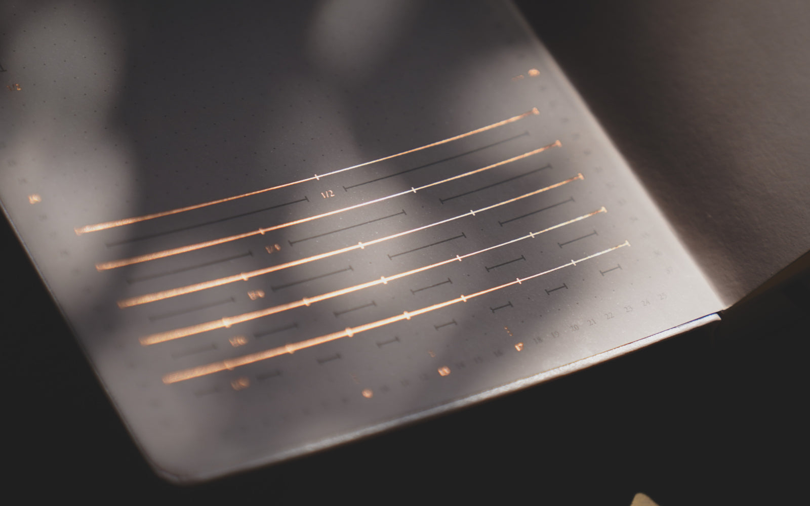
The Grid
The new dot-grid was designed to be visually balanced when divided. In addition to the Grid Guide at the front of the notebook, you'll also find page dividers on the inner and bottom margins of each page. They were designed to be subtle enough to disappear when you're not looking for them, but quickly accessible when you are. They'll help you quickly layout your spreads.
That's also why the page number is centered: to help you quickly find the middle of the page. It also makes it cleaner when threading your Collections.
Page Status Bullet
When you start Bullet Journaling heavily, chances are you'll have a lot of Tasks. Sometimes that results in hunting through your pages for opens Tasks. I needed a quick way to see which pages still need attention, and which ones were complete. I wasn't alone in this. I saw various clever approaches in the BuJo community tackling this challenge, which inspired me to develop my own solution: the page status bullet.
Just below the page number, you'll see a Task bullet. This represents the status of your page. Once you've completed everything on a page, you can mark it as complete using the "X". No more hunting for open Tasks!
You can also use the page status bullet to mark pages as special or important using different symbols or colors, or indicate if you've migrated a page's content. It's up to you. This will help you quickly locate special pages and orient yourself in a Collection.
The page status bullet is a small feature that's already proven to be a huge time saver for me, especially during monthly reflection/migration. It also feels really satisfying to mark a whole page as complete.

The Paper
The new paper used in Edition 2 was created specifically for Bullet Journalists. There are many different ways the community expresses themselves inside their notebooks, and we engineered our paper accordingly.
For the more artistic among us, its 120 GSM weight and composition makes the paper much more art/color friendly than to 80 GSM in Edition 1, while not being as rigid or heavy as an art journal.
It's a soft white color makes it easy on the eyes for extended journaling. The composition of the new paper drastically reduces ghosting, and texture is smooth with just enough tooth to make writing a real a pleasure.
Last but not least, the paper is also F.S.C certified, which means that it's sustainably sourced. This is a really big deal for me as I continue to look for ways to make Bullet Journal as a company intentional. More on that in another article.
The Pocket Guide
I've been teaching BuJo for almost seven years now. In that time, I've learned a lot about how to explain it more effectively. A lot of those learnings have gone into the creation of the Pocket Guide included in the Edition 2.
The Pocket Guide features a lot of visual examples, as well as demonstrating what an average month Bullet Journaling looks like. It shows how all the pieces come together. This makes it a great resource for both beginning and seasoned Bullet Journalist's alike.
If you don't need the guide, then it makes for a nice little gift that you can give to someone you think could benefit from learning how to Bullet Journal.
The guide fits perfectly into the included back pocket of the notebook without adding a lot of bulk. This allows it to serve as a ruler when laying out your pages.


The Sticker Sheet
Designed to remove even more friction from your practice, it features a bunch of super lightweight tools to save you time. Stickers include:
- The name of each month for your monthly logs, printed in metallic foil, because every new month is a milestone worth celebrating.
- 12 strips of days and 12 strips dates so you can quickly set up your Monthly Log's timeline.
- The foil dots can be used for priority tasks.
- Intentionality stickers. The larger foil dots and lightning bolt serve as visual cues to help you trigger desired behaviors. For example, stick a bolt next to your toothbrush to remember to floss. Place one on your monitor to remember to drink water. Put one on your phone case to remember not to pick it up as often. They're just simple ways to help expand your BuJo practice into the real world.

The End
This notebook has been years in the making, inspired by countless pieces of community feedback. I've done my best to listen, incorporating as much as possible while respecting the power of the blank page. After all, this notebook is designed to be a home for your thoughts, your feelings, your life.
A happy home is built on love, and a lot of love went into designing Edition 2. I hope it serves you well.
Happy Bullet Journaling,
Ryder


Jovan Ždrnja
July 14, 2025
The BuJo 3rd Edition Ideas:
• Dedicated hard cover “BuJo Sleeve” to protect the notebook. Offered as an optional add-on that can be purchased.
• Two compartments separated in the back pocket: one for miscellaneous items, the other for more important stuff.
• A list of possible symbols to use and personalize for your BuJo journey, printed on an extra piece of paper.
I am a big fan of the work you’re doing and would love the opportunity to be part of your team. Please let me know if you are currently looking for new employees.
Respectfully,
Jovan Ždrnja